A2UI v0.9 Specification: Deep Dive into Server-Side Theming and Styling Control
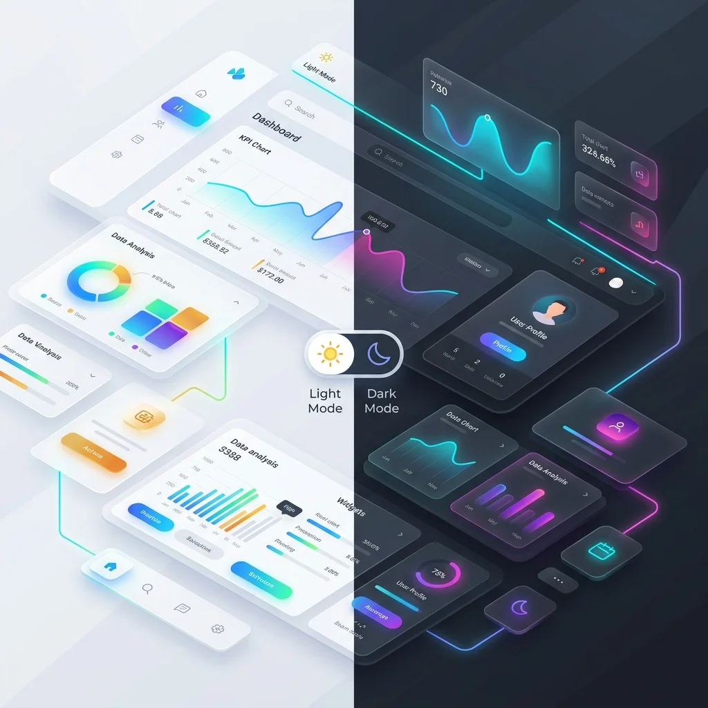
Explore how the upcoming A2UI v0.9 specification introduces server-side theming tokens that adapt layouts dynamically without exposing client styles to AI agent hallucinations.
As Generative UI moves from experimental chat widgets to business-critical applications, design continuity has become a major roadblock. How do you allow an AI agent to dynamically highlight elements, signal warnings, or apply custom merchant branding without ruining the carefully crafted visual system of the host application?
The upcoming A2UI v0.9 Draft Specification solves this issue by introducing a formal, structured system for Server-Side Theming and Styling Control.
The Problem: Agent-Dictated Styling Hallucinations
In early Generative UI implementations, agents frequently suffered from “styling hallucinations.” If an agent wanted to draw a checkout card, it would attempt to output raw styling commands like:
// The old, fragile way
{
  "type": "button",
  "style": {
    "backgroundColor": "#FF5733",
    "borderRadius": "12px",
    "fontSize": "19px"
  }
}
This caused three massive failures:
- Design System Breakage: The button color (
#FF5733) clashed with the host application’s primary palette (e.g., Tailwind tokens or CSS variables). - Platform Incompatibility: CSS properties like
borderRadiusdo not exist in native iOS SwiftUI (.cornerRadius()) or Flutter (BorderRadius.circular), resulting in rendering crashes or complex client-side translation layers. - Dark Mode Failures: Hardcoded colors did not adapt when the user toggled the host application to dark mode, rendering text unreadable.
The A2UI v0.9 Solution: Semantic Theming Declarations
The core philosophy of A2UI v0.9 is simple: The Agent dictates the semantic intent, while the Host Application dictates the visual execution.
Instead of accepting raw color codes and pixels, A2UI v0.9 introduces a 3-tier token mapping architecture:
┌──────────────────┐      ┌────────────────────┐      ┌──────────────────┐
│ Server Intent    │ ───> │ Semantic Token     │ ───> │ Native Platform  │
│ (e.g., "danger") │      │ (e.g., "sys.error")│      │ Render (SwiftUI) │
└──────────────────┘      └────────────────────┘      └──────────────────┘
The server streams a themeIntent field in the component metadata. The host application maps these intents to its pre-defined design tokens, ensuring perfect dark mode adaptation and platform compliance.
The Specification in Action
Here is a schema snippet showing how v0.9 represents a styled dashboard card dynamically themed by the agent:
{
  "surfaceUpdate": {
    "surfaceId": "billing-dashboard",
    "components": [
      {
        "id": "status-banner",
        "component": {
          "type": "Banner",
          "props": {
            "title": "Account Overdue",
            "message": "Please update your payment method to avoid interruption."
          },
          "theme": {
            "intent": "critical",
            "elevation": "sunken",
            "density": "comfortable"
          }
        }
      }
    ]
  }
}
How the Client Renders v0.9 Themes
When the A2UI client-side engine (for example, in React, SwiftUI, or Jetpack Compose) parses the critical intent:
- Web (React): Maps
criticalto classes likebg-red-50 text-red-900 border-red-200 dark:bg-red-950/20 dark:text-red-300. - iOS (SwiftUI): Resolves the colors against the Asset Catalog using
Color("SystemCriticalBackground")andColor("SystemCriticalText"), respecting the system-wide Dark Mode state. - Android (Compose): Uses
MaterialTheme.colorScheme.errorContainerandcontentColorFor(errorContainer).
Dynamic Brand Overrides (Merchant Branding)
A common enterprise requirement is applying customized merchant branding to AI-generated interfaces (e.g., matching a Shopify store’s theme colors).
A2UI v0.9 handles this by declaring a global theme context at the top of the session. The agent never specifies the merchant’s exact hexadecimal colors; it simply references the active theme ID:
{
  "surfaceUpdate": {
    "surfaceId": "storefront",
    "themeOverride": {
      "paletteId": "merchant-gold",
      "mode": "dark"
    },
    "components": [
      {
        "id": "add-to-cart",
        "component": {
          "type": "PrimaryButton",
          "props": { "label": "Add to Bag" }
        }
      }
    ]
  }
}
The host app resolves "paletteId": "merchant-gold" locally from an authorized configuration, ensuring that arbitrary, unvetted colors are never injected dynamically by the LLM.
Comparing Styling Approaches: v0.9 vs. Competitors
How does A2UI’s styling architecture compare to other paradigms in 2026?
- Vercel json-render: Relies on CSS/JS styling runtimes. If a component needs dynamic style shifts, it must be pre-coded in React, or the agent must inject Tailwind utility classes (which restricts native mobile rendering).
- MCP Apps: Since MCP Apps render inside HTML iframes, they bring their own stylesheets. This often leads to “visual fragmentation,” where the AI widget uses different fonts, scrollbars, and color palettes than the main app.
- A2UI v0.9: Achieves absolute visual integration. Because rendering happens locally using host components, the AI interface is visually indistinguishable from hardcoded parts of the app.
For a deeper dive into how this relates to sandboxed applications, read our article: MCP Apps vs. A2UI: Sandboxes vs. Native Blueprints. To see how these specs fit into our release schedule, refer to the A2UI Roadmap.